

Benchmarking in Excel: KPI, Salary, Competitive & Performance
TL;DR: Benchmarking in Excel helps teams compare performance against targets, peers, market data, or historical baselines in a structured and actionable way.
With the right workbook design, Excel can support KPI tracking, salary benchmarking, competitive analysis, dashboards, and action planning.
As data volume, collaboration, or automation needs grow, teams should reassess whether Excel is still enough or whether BI and dedicated analytics software are a better fit.
Benchmarking in Excel: Definition, Use Cases, and Executive Value
When performance data is spread across exports, survey files, project trackers, and finance spreadsheets, leaders can spend more time cleaning up the numbers than using them. Benchmarking in Excel gives that work a sharper purpose. It turns disconnected data into a clear comparison against a target, baseline, peer group, or industry standard.
That matters more than ever for teams dealing with tighter targets, fragmented reporting, project sprawl, and closer scrutiny around operational and compensation decisions. Excel remains one of the most common tools for this work because it is flexible, familiar, and quick to adapt when the business question changes. It is a powerful tool for data analysis when the workbook is structured well and the data is kept clean.
This guide walks through how benchmarking in Excel works in a business setting, where it creates the most value, how to structure models and dashboards, and when Excel is the right fit versus when a more specialized solution makes sense. Use the sections below to build cleaner comparisons, uncover performance gaps, and turn those findings into action.
What Benchmarking in Excel Means for Business Decision-Makers
At its simplest, benchmarking in Excel means organizing performance data and comparing it to a defined reference point. That reference point might be a historical baseline, an internal target, a competitor metric, or an industry standard. The goal is straightforward: see where you stand and where there is room to improve.
For business leaders, that usually means building structured spreadsheets that highlight gaps, trends, and relative performance in a format people can actually use. Excel works well here because it is adaptable. You can combine data from different sources, calculate variance with formulas, and build visual summaries that make the comparison easy to understand. Benchmarking also involves measuring performance and tracking metrics over time so the analysis stays useful, not just descriptive.
What makes Excel especially practical for managers and executives is that it does not require specialized software or a steep learning curve to get started. A well-built workbook can act as a benchmarking dashboard that a finance director, operations manager, or HR leader can maintain without constant IT support. The same file can hold benchmark data, formulas, and reporting views without forcing the team to jump between other software tools.
Common Benchmarking Use Cases: KPI Tracking, Salary Benchmarking, Competitive Analysis, and Operational Performance
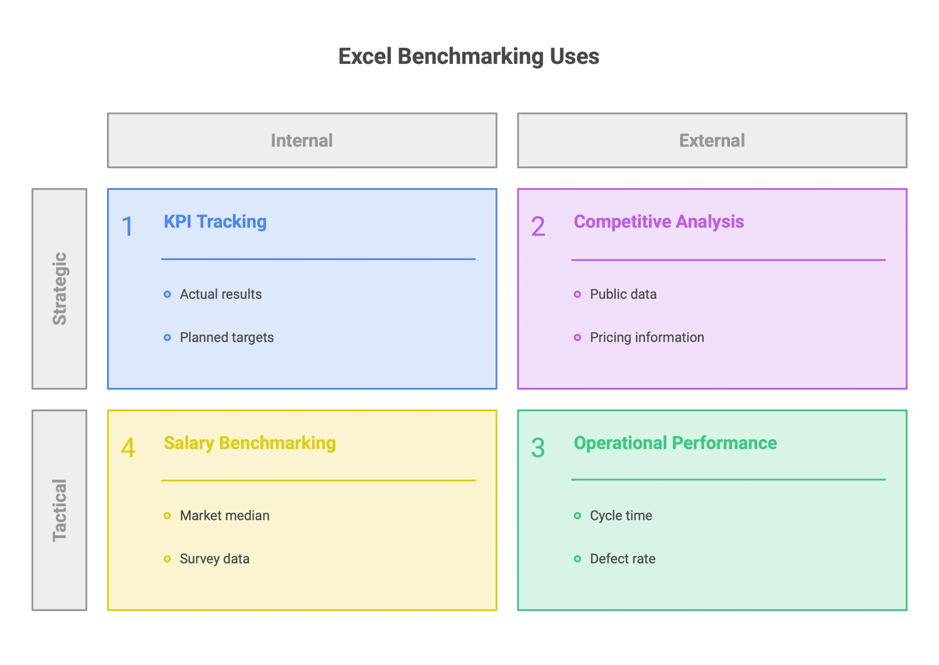
Excel-based benchmarking shows up across many business functions. The setup is usually the same: measured values, reference values, and a clear comparison that shows the gap.
KPI TrackingTracking key performance indicators against targets is one of the most direct uses for benchmarking in Excel. Teams can create tables that compare actual results to planned targets across time periods, departments, or product lines, which also supports performance tracking for goals and marketing effectiveness. Conditional formatting and simple charts make performance easy to scan.
Salary and Compensation BenchmarkingHR and finance teams often use Excel to compare internal pay data with market rates. That usually means mapping job roles to salary bands, importing survey data or published compensation ranges, and measuring how current pay aligns with the market median or a target percentile. The output helps leaders spot retention risk, plan compensation changes, and keep pay structures internally consistent.
Competitive AnalysisExcel is also useful for structured competitive benchmarking. Teams can organize public data, pricing information, or capability comparisons across competitors in a consistent format, making positioning much easier to see. The quality of the analysis still depends on the quality of the data, of course, but Excel gives teams a clear structure instead of scattered notes or informal comparisons.
Operational PerformanceOperational benchmarking in Excel often focuses on metrics like cycle time, defect rate, cost per unit, or resource utilization. By comparing those figures with historical performance or external benchmarks, operations leaders can see where improvement work should focus and whether changes are actually moving the numbers.
Across all these use cases, Excel’s real value is turning raw data into a structured comparison that supports a specific business decision. That is where it earns its place.
When Excel Is the Right Tool and When to Consider BI or Dedicated Analytics Platforms
Excel is a strong choice when the data set is manageable, updates happen on a predictable schedule, and the people using the output are comfortable in spreadsheets. In that sense, benchmarking in Excel also works as a practical form of KPI tracking. For many mid-sized teams, that is enough. A well-designed benchmarking model in Excel can support day-to-day decisions without adding unnecessary complexity.
But Excel does have limits. As data volumes grow, manual refreshes become harder to maintain and easier to get wrong. In KPI Tracking, a structured benchmark view matters because 42% of project professionals spend days collating reports manually. If multiple users need access to the same file at the same time, version control can quickly become a headache, and communication often becomes scattered across emails and duplicate files. And if benchmarking needs to connect to real-time sources, support more advanced statistical analysis, or align with broader accounting workflows, Excel may no longer be the best fit. Excel becomes difficult with multiple users editing the same file, and version conflicts can slow down reporting.
In those cases, business intelligence tools or dedicated analytics software usually offer a better path. They can connect directly to data sources, automate refreshes, and handle more advanced reporting and visualization. For organizations working across large datasets or multiple business units, that extra capability often saves time and improves the quality of the analysis. Dedicated software can also provide real-time updates and centralised data, which helps with improving accuracy, reduces manual entry, strengthens security, and improves reporting consistency.
The practical rule is simple: start with Excel if it meets the need and your team already works in it. Reassess when the data gets more complex, collaboration becomes harder, or reporting starts taking more effort than it should.
Planning the Benchmarking Model: Objective, Peers, Period, and Scope
Before you open Excel and start building formulas, the real work begins with planning. A good benchmarking model does not come together by accident. It starts with clear decisions about what you want to measure, who or what you want to compare against, and what a meaningful result actually looks like. Skip this step, and you usually end up with a spreadsheet full of numbers that does not say much.
This section covers the planning steps that turn a basic comparison exercise into a useful Excel-based benchmarking process.
Define the Benchmarking Objective and Time Period Before Building the Workbook
The first step is also the most important: know what you are trying to learn before you build anything. Without a defined objective, your workbook can quickly turn into a data dump instead of a decision-making tool.
According to the workflow outlined by Infoexperiencia, benchmarking begins with defining the objective and the comparison period. Those two choices shape everything that follows, from the data you collect to the number of columns in your workbook and how you interpret the results.
A few practical questions to answer at this stage:
- What specific performance area are you trying to improve or understand?
- Are you comparing results over a single quarter, a full fiscal year, or several periods?
- What decision will this analysis support once it is complete?
The time period is not just an admin detail. It affects how relevant your peer data is, how consistent your metrics are, and whether your conclusions will hold up when someone asks hard questions. Getting this right before you open a blank workbook saves a lot of cleanup later.
Choose Benchmark Peers, Industry Standards, or Internal Comparison Groups
Once the objective is clear, the next question is who or what you are comparing against. This is where many benchmarking efforts go sideways, either by choosing peers that are not truly comparable or by pulling in so many groups that the analysis becomes muddy.
The Infoexperiencia benchmarking template handles this as a separate step called "register benchmark peers," which is mapped to its own sheet in the workbook. That separation is intentional. It keeps the reference group organized and easy to follow throughout the model.
Your comparison group might include:
- External competitors or industry peers operating in similar markets
- Published industry standards or benchmarks relevant to your sector
- Internal divisions, teams, or project types within your own company
The key is to choose peers because they are relevant to your objective, not simply because their data is easy to pull into the file. A clean, well-defined referent list makes the comparison easier to manage and gives your results more credibility when you present them to stakeholders.
Set Clear Criteria for What Will Be Compared and Why It Matters
With the objective set and the peers identified, the final planning step is deciding exactly what will be compared. These are your benchmarking criteria, and they become the backbone of your Excel model.
As Infoexperiencia lays out, the comparison phase focuses on concrete criteria, which then feeds into identifying performance gaps and turning those gaps into an action plan with assigned owners and deadlines. That only works if the criteria are specific enough to reveal real differences in performance.
Vague criteria lead to vague results. Strong benchmarking criteria usually have a few things in common:
- They are measurable and available across all peers in the reference group
- They connect directly to the objective defined in the first step
- They are specific enough to point to a process or behavior that can be improved
Defining the criteria upfront also shapes the workbook itself. Each criterion usually becomes a column in the comparison sheet, and the relationships between those columns drive the gap analysis that follows. If the criteria are unclear at the planning stage, the whole model becomes harder to read and even harder to act on. Proper benchmarking requires defining the benchmark methodology before analyzing results.
Taking the time to get this right before building the spreadsheet is what separates benchmarking that drives change from benchmarking that simply describes the current state.
Building a Benchmarking Excel Template: Data Structure, Metrics, and Inputs
A well-built benchmarking template does more than store numbers. It gives you a repeatable way to compare performance, spot gaps, and present results in a format that supports real decisions. If the structure is weak, the model becomes just another crowded spreadsheet. Get the foundation right, and it becomes a tool people can trust.
That foundation starts with how sheets are organized, which parameters are defined up front, and how data quality is handled from the beginning.
Create Dedicated Sheets for Raw Data, Benchmark Peers, Comparison Tables, and Reports
One of the easiest ways to keep a benchmarking model clean is to give each function its own worksheet. When raw inputs, peer data, comparison logic, and reporting all sit on the same sheet, large excel files get messy fast and become harder to audit and maintain. It becomes harder to audit, harder to update, and easier to break. Raw data should be separated from analyses to prevent accidental overwrites.
A better setup is to separate the model into clear layers:
- Raw Data sheet for unprocessed inputs and source metrics
- Benchmark Peers sheet for the reference group or industry standard values
- Comparison Tables sheet where calculated differences and rankings are generated
- Reports sheet for charts, summaries, and executive-facing outputs
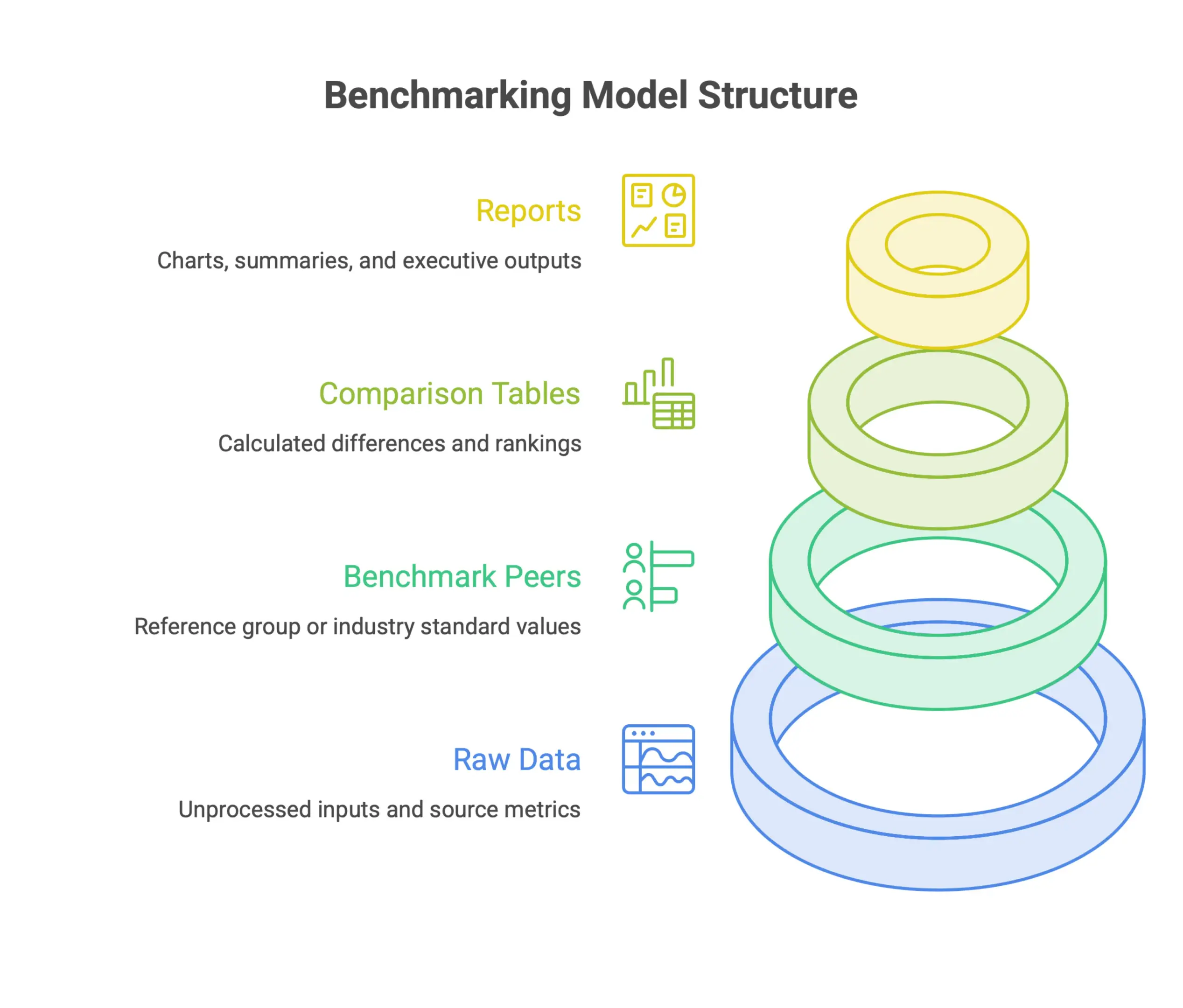
Templates Analytics follows this kind of structure in its benchmarking Excel template, with real-time benchmark visualization alongside comparison tables. The reporting layer stays connected to the underlying data, so users are not stuck manually reformatting charts every time inputs change.
Using Excel Tables for the raw data area is also a practical upgrade. Excel Tables support dynamic formula references, which helps formulas expand as new rows are added and keeps benchmark files easier to manage as monthly data grows. That is especially helpful when the workbook is updated month after month.
This layout also makes collaboration easier. Analysts can update inputs without disturbing formulas, and decision-makers can review the reports sheet without digging through the full model. It also reduces errors in complex spreadsheets and keeps the workbook more accurate over time.
Use Parameters Such as Time Frame, Sample Group, Cost Factors, and Business Unit
Raw data by itself does not create a meaningful benchmark. The value comes from narrowing the comparison so you are looking at the right data, over the right period, under the right conditions.
That is why a dedicated parameters section is so useful. It lets users define the scope before calculations start. Common inputs include:
- Time frame to set the analysis period
- Sample group to define which peers or cohorts are included
- Cost factors and additional costs to reflect actual operating conditions
- Business unit to segment results across departments or teams
Templates Analytics specifically asks users to enter parameters like time frame and sample group before adding financial factors and other costs. That kind of setup keeps benchmarks grounded in real business conditions instead of loose averages that do not tell you much.
Keeping these inputs in one clearly labeled section also makes the template easier to reuse. Change the time frame or swap the peer group, and the full model updates without formula edits scattered across multiple sheets. That saves time and lowers the risk of errors.
Account for Sample Size and Data Reliability in Performance Benchmarks
A benchmark is only as strong as the data behind it. One common mistake is showing an average without saying how much data supports it. A figure based on three records is not the same as one based on three hundred.
Building sample size tracking into the template solves that problem early. Instead of treating every benchmark as equally reliable, the model shows where the data is thin and where the result should be viewed with caution. This is especially important for financial data, project results, and other business metrics where small sample sizes can distort the story.
Excel for Sport shows this clearly in a sports analytics example, using Excel functions like UNIQUE, AVERAGEIF, and COUNTIFS to benchmark athlete performance across defined sample sizes. By calculating both the average and the count for each athlete under different conditions, the model makes it easier to judge how reliable each benchmark really is. The same principle applies in business settings.
Whether you are comparing cost per unit, project timelines, or productivity metrics, pairing each benchmark with the number of supporting records gives reviewers the context they need to interpret the result properly. That improves accuracy and strengthens reporting.
A few practical ways to build this into your template:
- Add a count column alongside every average or ratio in your comparison tables
- Use conditional formatting to flag benchmarks that fall below a minimum sample threshold
- Include a data reliability indicator in the reports sheet so stakeholders can see at a glance which metrics are well-supported
That kind of transparency makes the analysis easier to trust and much easier to defend when questions come up.
Choosing KPI Benchmarks: Targets, Leading Indicators, and Lagging Indicators
Picking the right KPIs is where benchmarking either becomes useful or turns into another spreadsheet nobody trusts. Many teams run into the same issues: too many metrics, the wrong mix of forward-looking and historical measures, or targets that were set once and never revisited. Before building a single chart in Excel, it is worth slowing down and deciding which metrics belong on the dashboard, what each one measures, and how targets should be managed over time.
Limit Each Benchmarking Dashboard View to the Most Important KPIs
More metrics rarely mean better insight. Once a dashboard starts showing 15 or 20 KPIs, it usually becomes harder to read, not easier. People scan the numbers, but they do not always know what deserves attention, and the point of benchmarking gets buried in the noise.
A better approach is to keep each dashboard view tight. AppDeck makes this point directly in its 2026 KPI dashboard template for Excel, recommending just 5 to 7 KPIs per view. That limit is deliberate. It forces teams to choose what really matters and keeps the dashboard focused on decisions, not data overload.
When you build your own benchmarking setup in Excel, the same rule applies:
- Identify the metrics your team actually uses to make decisions
- Remove any KPI that gets reviewed but never changes an action
- Move supporting metrics into secondary views instead of crowding the main dashboard
The aim is simple: give someone a clear read on performance in under a minute.
Separate Leading KPIs from Lagging KPIs for Better Decision-Making
Not every KPI tells you the same thing. Some show what has already happened, like quarterly revenue or customer churn over the past 90 days. Others point to what is likely coming next, like pipeline coverage or employee training completion rates. If those two types of metrics are mixed together, teams tend to manage reactively when they could be acting earlier.
The easiest fix is to label each KPI clearly as either leading or lagging. AppDeck builds that distinction into its Excel template, so users can tell at a glance whether they are looking at a forward-looking signal or a historical result.
That separation matters because:
- Lagging indicators show whether past decisions worked. They are useful for reporting and accountability.
- Leading indicators give teams a chance to correct course before the result is locked in.
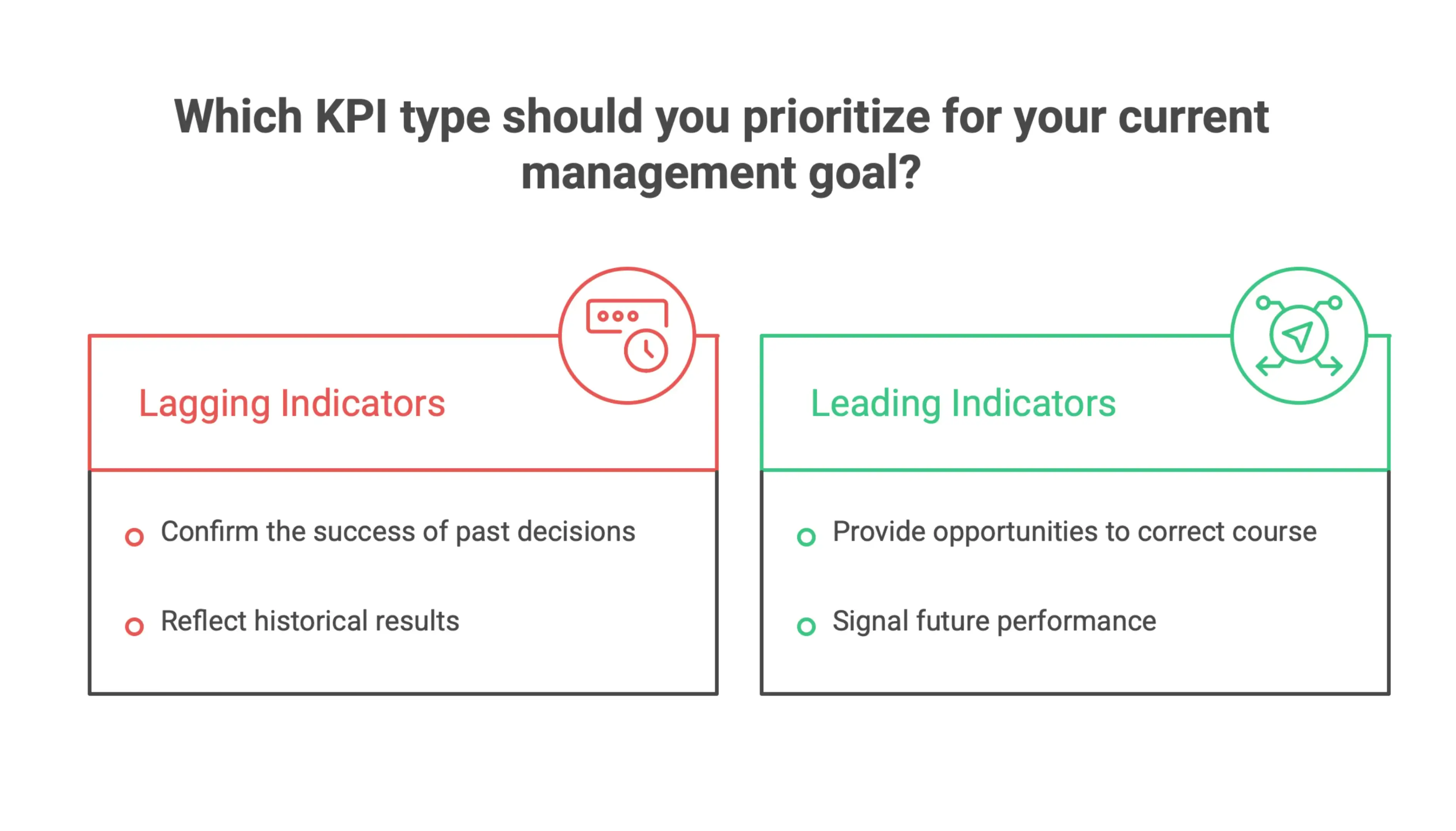
When your Excel dashboard separates these categories visually or structurally, managers can move with more confidence. They know which numbers are telling the story of the past and which ones call for action now.
Set Up Actual-vs-Target Benchmarking Over Time
Choosing the KPI is only part of the job. You also need a target, and you need a consistent way to measure performance against it over time. Without that structure, benchmarking gets subjective fast, and month-to-month comparisons stop meaning much.
The most practical setup in Excel is to lock in targets for a defined period and then enter actual results as they come in. AppDeck uses this model in its template, pairing fixed targets with Red, Yellow, and Green status flags, plus variance and trend views. That creates a benchmarking layer inside the spreadsheet instead of pushing the comparison into a separate report.
Someka uses a similar approach in its Excel KPI dashboard products. Targets and KPI definitions are configured up front, and users only need to update monthly actuals. The formulas and visuals handle the comparison automatically, which means there is no need to rebuild the logic every reporting cycle.
This setup is useful because it:
- Keeps targets stable and comparable across periods
- Automates the actual-vs-target calculation so reporting stays consistent
- Makes trend analysis easier without monthly manual rework
Whether you use a pre-built template or build the model yourself, the principle is the same: define targets once, enter actuals consistently, and let Excel show the variance automatically. A benchmark is simply the difference between actual results and the benchmark standard, and percentage variance shows that difference as a percentage.
Salary Benchmarking in Excel: Compensation, Pay Equity, and Regional Adjustments
For HR and finance leaders, salary benchmarking is one of the more important analytical exercises on the calendar. Done well, it helps keep pay competitive, supports internal equity, and gives teams a solid basis for compensation decisions. Excel is still one of the most common tools for the job, mainly because it can handle fairly complex compensation data without forcing teams into specialized software.
This section covers three practical workflows that make Excel useful for salary benchmarking: normalizing pay for geographic and market differences, using pivot tables to spot compensation patterns across the workforce, and applying conditional formatting to surface pay gaps before they become compliance or retention problems.
Normalize Salaries for Geography, Cost of Living, and Market Differences
Raw salary numbers rarely tell the full story. A software engineer earning $95,000 in Austin and another earning $130,000 in New York may look far apart on paper, but they could be much closer in terms of local market value. To compare fairly, those salaries need to be normalized against regional cost-of-living and market conditions.
In Excel, this is straightforward to set up with indexed multipliers. As outlined in Sparkco, the method uses a base salary multiplied by a regional cost-of-living factor. A baseline market is set at 1.0, while higher-cost locations are assigned proportionally higher values. For instance, a New York adjustment factor of 1.5 lets you compare that role more realistically against the same job in a lower-cost region.
Once those adjusted figures are in place, you can place them side by side in a comparison table and see how each role lines up with market benchmarks. That is a much better decision-making view than looking at raw numbers alone, because it strips out geographic noise and keeps the focus on competitiveness. Normalized KPIs should be calculated for meaningful comparisons between different entities.
A few practical tips for building this in Excel:
- Keep a dedicated reference table for regional index values so updates only need to happen in one place
- Use named ranges to make adjustment formulas easier to read and audit
- Add a column for the data source or benchmark date so the model stays transparent
This is also where support from finance or HR analysts matters. A small error in regional factors can distort the entire benchmark.
Use Pivot Tables to Compare Compensation by Role, Region, Department, and Demographic Group
Once the data is normalized, the next step is to analyze it in a structured way. Pivot tables are the right tool here because they let you break down compensation data across multiple dimensions quickly, without rewriting formulas or rebuilding the workbook.
The most useful views for salary benchmarking usually include comparisons by job role, geographic region, department, and demographic group. Each view answers a different question. Role-level analysis shows whether specific positions are above or below market. Regional views show whether your adjustments are working as intended across locations. Departmental breakdowns can reveal whether compensation decisions are being applied consistently. And demographic views, which Sparkco specifically recommends including, help teams identify pay gaps across gender, tenure, or other workforce segments.
To build a useful compensation pivot table in Excel:
- Start with clean, consistent column headers before creating the pivot
- Use average salary as the main value field, and include headcount as a secondary measure for context
- Apply filters for employment type, level, or tenure so outliers do not distort the analysis
- Build separate pivot views for internal comparisons and external market comparisons to keep the work organized
Pivot tables should not be treated as one-time outputs. Refresh them regularly as new compensation data comes in, and use them as an ongoing analysis layer instead of a static report. PivotTables are ideal for summarizing large sets of benchmark data by categories.
Apply Conditional Formatting to Flag Pay Gaps and Market Misalignment
Analysis only matters if it leads to action. Conditional formatting is one of the simplest ways to turn compensation data into clear, visible signals that HR and finance teams can use right away.
Sparkco recommends using conditional formatting to highlight pay gaps and salaries that fall outside market alignment. It turns a dense spreadsheet into something much easier to read at a glance, with the problem areas standing out immediately.
In practice, this means setting rules that automatically color-code cells or rows based on defined thresholds. Common uses include:
- Flagging roles where adjusted salaries fall below a target market percentile
- Highlighting demographic groups where average pay differs from the overall mean by more than an acceptable range
- Marking employees whose pay has not been reviewed within a set timeframe
Color scales work well when you want to show relative position across a range. Icon sets are useful for signaling urgency, especially when some roles need immediate review and others are only slightly off target. Data bars are a simple way to show distribution without forcing the reader to dig through the raw numbers. Excel supports conditional formatting rules based on values and calculations for benchmarking, and that helps make benchmark data easier to interpret.
The goal is not to make every spreadsheet look like a dashboard. It is to make the most important findings obvious the moment someone opens the file. That is where Excel-based salary benchmarking becomes genuinely useful. It turns a pile of data into something a compensation reviewer can act on quickly.
Competitive and Multi-Criteria Benchmarking in Excel
When you are comparing multiple companies, vendors, products, or internal business units side by side, one metric usually is not enough. The real value in competitive benchmarking comes from looking at several factors at once and weighting them based on what matters most to your organization. Excel is well suited for that kind of analysis. With scoring matrices and comparison tables, it helps turn subjective judgments into decisions you can defend.
Build a Multi-Criteria Benchmarking Matrix for Competitors, Vendors, or Business Units
The starting point for any benchmarking exercise in Excel is a clear, well-structured matrix. The format is simple: put the entities you are comparing, whether that means competitors, vendors, departments, or products, down the rows and list the criteria across the columns.
Each cell holds a score or a note for that specific entity and criterion. That structure keeps the analysis organized and consistent, even when the comparison gets broad or the criteria list starts to grow.
A good example is the downloadable template from Soren Kaplan, which uses this exact row-and-column setup. Organizations sit in the rows, core features or attributes run across the columns, and each cell captures both a score and supporting notes. It scales cleanly whether you are comparing three vendors or ten business units across a dozen criteria. This kind of spreadsheet makes data management much easier for the team.
When you build your own version, keep a few basics in mind:
- Define your criteria before entering scores so the analysis does not drift halfway through
- Keep each criterion specific and measurable so different reviewers score it the same way
- Use a dedicated notes column or cell comment to explain the reasoning behind each score
Score Features, Capabilities, or Attributes Consistently Across Peers
A benchmarking matrix is only useful if the scoring behind it is consistent. If one reviewer treats a 1 to 5 scale loosely and another scores it strictly, the comparison falls apart quickly. Consistency matters here.
Set your scoring scale first, then define what each value means before you begin. If you are rating vendor capabilities from 1 to 5, make it clear what separates a 3 from a 4. Put that guidance directly on the worksheet, either in a reference table or a short note at the top.
The Soren Kaplan template does this well by pairing each score with a note in the same cell. That gives you a record of why the score was assigned, which makes review and validation much easier later on.
Practical habits that help keep scoring consistent:
- Score all entities against one criterion before moving to the next
- Use dropdown validation in Excel so users can only select values from your defined scale
- Avoid blank cells. Use zero or a clearly marked placeholder so the matrix stays complete and calculable
Use Weighted Scores to Identify Top-of-Class Performers and Strategic Gaps
Raw scores show how each entity performed on a given criterion, but they treat every criterion as equally important. Weighting fixes that. When you assign a multiplier based on strategic relevance, the analysis moves from a simple average to a more realistic, priority-based view.
In Excel, this is usually handled by adding a weight row above or below the criteria headers. Each score is multiplied by its corresponding weight, then summed to produce a total weighted score for each entity in the matrix.
The Soren Kaplan template automates that final step with formulas that calculate an overall benchmark score for each organization. That makes it easier to spot top performers across the full set of criteria without manually adding everything up.
The real value goes beyond rankings. Once you sort the results and look at them side by side, the gaps become hard to miss. A vendor may look strong overall but fall short on a heavily weighted criterion, and that becomes a meaningful signal for sourcing, partnership decisions, or internal improvement priorities.
To get more value from weighted scoring in Excel:
- Assign weights as percentages that add up to 100 so the scoring model stays easy to interpret
- Use conditional formatting to highlight the highest and lowest weighted scores for each criterion
- Revisit weights regularly, especially when priorities change, so the model reflects current strategy instead of outdated assumptions
Benchmarking Dashboards in Excel: Visualizing Gaps, Trends, and Status
Raw benchmarking data does not do much when it sits in a table. The real value comes from turning that data into a dashboard that shows decision-makers, at a glance, where performance stands, where the gaps are, and what needs attention. Excel can handle that well, without forcing teams into a full BI stack.
Convert Raw Benchmark Tables into Executive Dashboards
The first step is to stop thinking only in rows and columns and start thinking about what an executive actually needs to see. That means organizing benchmark data in a way that supports charting, filtering, and quick interpretation.
The approach shown in the YouTube tutorial on Benchmarking and Insights Dashboard in Excel follows exactly that path. It takes consolidated benchmark metrics and turns them into a dashboard that connects the numbers to clear visual outputs. The key is to set up the data properly from the start, with clearly labeled metrics, target values, and actual performance figures arranged in a consistent format that charts can pull from cleanly.
A few practical steps that support this approach:
- Separate your data layer from your display layer. Keep the raw benchmark tables on one sheet and use formulas or named ranges to feed the dashboard.
- Use a summary metrics block near the top of the dashboard to surface the most important comparisons right away.
- Design for scanning, not reading. Executives should understand the dashboard in under 30 seconds.
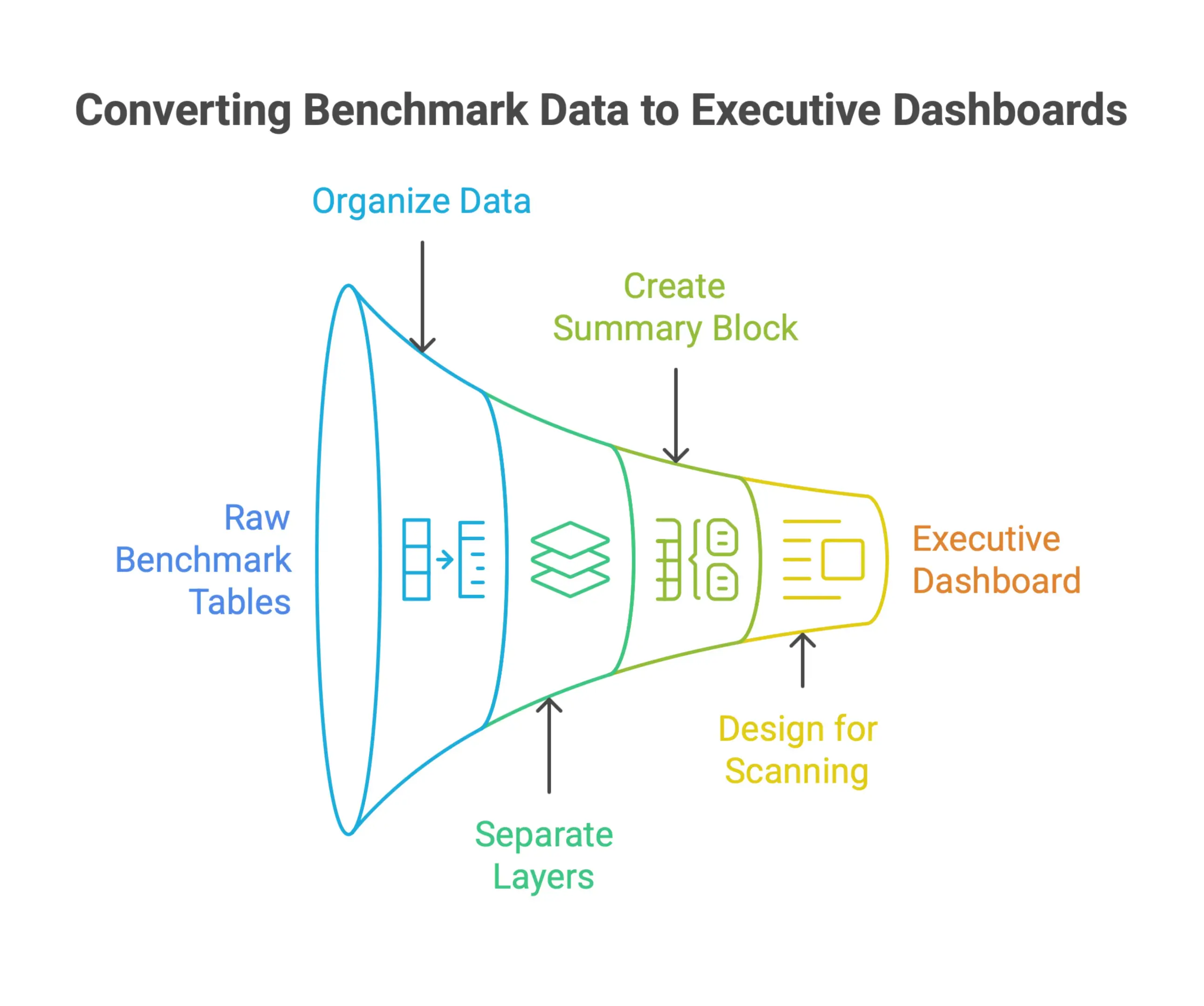
When the data is structured well and the layout is intentional, moving from a raw table to an executive-ready view becomes much easier. That is why thoughtful reporting matters as much as the calculations themselves.
Use Charts, Benchmark Ranges, and Variance Views to Highlight Performance Gaps
Charts do most of the work when it comes to showing performance gaps. A table asks the reader to compare numbers in their head. A good chart makes the gap obvious immediately.
As shown in the Benchmarking and Insights Dashboard in Excel tutorial, linking charts directly to benchmark ranges lets users see at a glance where actual performance sits relative to target. That is usually a much better way to communicate than relying on raw figures alone.
Some chart and variance view approaches that work well in benchmarking dashboards:
- Bullet charts or bar charts with reference lines to show actual versus benchmark side by side
- Variance columns that calculate and display the difference between actual and target, with negative gaps highlighted in red
- Combo charts that place actual performance against a shaded benchmark range, so acceptable performance has context
- Small multiples for comparing the same metric across multiple projects, departments, or time periods
The point of any of these views is to reduce mental effort. The reader should not have to work through the comparison themselves. The chart should make that comparison for them, and it should create insightful reports that support business action.
Design Red, Yellow, and Green Status Indicators for Fast Executive Interpretation
Traffic-light indicators are one of the most effective tools in an executive dashboard. They turn detailed variance data into an immediate signal: on track, at risk, or off track.
In Excel, these can be built with conditional formatting, nested IF formulas, or icon sets. Each method has its place, depending on how the dashboard will be used and shared.
A practical setup for a benchmarking dashboard might look like this:
- Green when actual performance is within an acceptable threshold of the benchmark
- Yellow when performance is nearing a defined tolerance limit
- Red when actual performance falls outside the acceptable range
The thresholds should come from your benchmarking framework, not from guesswork. Tying them back to the benchmark ranges in your data structure, as shown in the Benchmarking and Insights Dashboard in Excel tutorial, helps make sure the status indicators reflect real performance standards instead of subjective judgment.
A few additional tips for making these indicators work in practice:
- Use icon sets in conditional formatting for a cleaner visual result than text-based status labels
- Place status indicators next to the metric, not off in a separate area, so the value and status are read together
- Include a legend somewhere on the dashboard so the thresholds are clear and defensible
When this is done well, a traffic-light system removes the need for extra explanation during routine reviews. The dashboard does the talking.
Turning Benchmarking Insights into Action Plans
Collecting benchmark data is only half the job. The real value comes when you turn those comparisons into a clear plan of action. Without a structured way to move from insight to initiative, benchmark gaps sit in a spreadsheet and never lead to change. This section shows how to close that loop, using Excel as both your analysis environment and your action-tracking hub.
Identify the Largest Performance Gaps and Prioritize by Business Impact
Once your benchmarking data is in place, the first step is separating meaningful gaps from background noise. Not every variance deserves immediate attention. The point is to focus effort on the gaps most likely to affect project outcomes, cost performance, or schedule.
A practical way to do this is to calculate both the absolute and percentage difference between actual performance and the benchmark value for each metric. From there, add a weighting factor that reflects business importance. A 15% cost overrun in a high-spend trade carries far more weight than the same percentage gap in a lower-value activity.
In Excel, a simple scoring matrix works well. Give each gap a score based on two things: the size of the variance and the financial or operational significance of the metric. Sort the list in descending order to surface the highest-priority items. Conditional formatting can make the picture even clearer by highlighting the most critical gaps so decision-makers can scan them quickly.
This step keeps action planning focused. Instead of spreading effort across every variance, you start with the issues most likely to move the needle.
Assign Owners, Deadlines, and Action Items for Each Benchmark Gap
Once you have a ranked list of gaps, each item needs three things before it becomes actionable: a specific initiative, a named owner, and a deadline. Without those, prioritization stays theoretical.
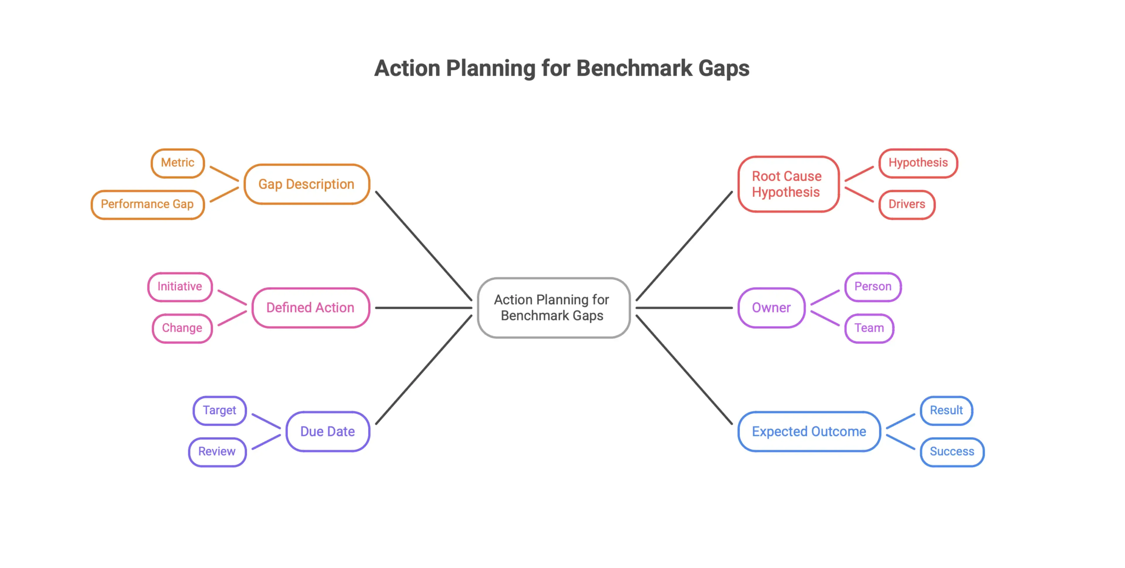
A dedicated action planning table in Excel keeps everything organized. Each row should represent one benchmark gap, with columns for:
- Gap description - what metric is underperforming and by how much
- Root cause hypothesis - a short note on what may be driving the gap
- Defined action - the specific initiative or change being implemented
- Owner - the person or team responsible for execution
- Due date - a realistic target for completion or first review
- Expected outcome - the measurable result that defines success
Keeping this table in the same workbook as your benchmark data preserves context. Anyone reviewing the plan can trace each action back to the gap that triggered it.
Excel’s data validation feature also helps keep the table clean. Dropdown menus for owner names and status categories make entries consistent and filtering much easier when you want to see open items by team or due date. It also reduces error prone manual entry.
Track Action Status and Results Inside the Same Excel Workbook
Assigning actions is only the starting point. Tracking progress and checking whether those actions actually close the original gap is what turns benchmarking into a real improvement process.
Add a status column to your action table with clear options such as Not Started, In Progress, Complete, and On Hold. A second column for progress notes gives owners a place to log updates without needing another tool.
Once an action is complete, update the related benchmark metric with fresh actuals. That creates a direct feedback loop. You can see whether the initiative moved performance in the right direction. If the gap is still there, the data tells you quickly, and you can revisit the root cause or escalate.
At this stage, it is worth building a summary dashboard tab. Use formulas to count open versus closed actions, show progress by owner, and highlight which benchmark gaps have been resolved. The charts do not need to be elaborate. A simple before-and-after bar view is often enough to give stakeholders a fast, clear read on progress.
This approach keeps your benchmarking workbook useful after the initial analysis is done. Instead of a static report that gets reviewed once, it becomes a working document that shows where performance stands today and what the team is doing about it.
Advanced Benchmarking in Excel: Automation, AI, and Workflow Evaluation
Benchmarking in Excel has moved well beyond static scorecards and manual data entry. As spreadsheet workflows get more complex and automation tools become more capable, the way professionals build, review, and maintain benchmarking models is changing too. This section looks at where things are heading, including how to reduce manual work with structured design, how Excel can function as a serious evaluation environment, and how to prepare models for AI-assisted analysis.
Use Pre-Built Formulas and Locked Structures to Reduce Manual Spreadsheet Work
One of the most practical ways to make benchmarking more efficient is to design Excel models so they do most of the heavy lifting from the start. In practice, that means building the calculation logic into the workbook with pre-built formulas, so users are entering data instead of rebuilding the model every time a new benchmarking cycle begins.
A few structural habits make a big difference here:
- Lock formula cells to prevent accidental edits that could break the logic
- Use named ranges to make formulas easier to read and audit
- Set up input zones that are clearly separated from calculation and output areas
- Use data validation rules to limit bad inputs before they enter the model
This kind of locked, structured setup is especially useful in team environments where several people contribute data. It keeps the process consistent without forcing everyone to understand every formula behind it. In the end, you get a benchmarking workflow that is more reliable and holds up over repeated use. It can also save time for reporting teams that need to manage recurring projects.
Understand Excel as a Benchmarking Environment for Complex Workflows
Most people think of Excel benchmarking as a way to track business KPIs or compare project costs. That is true, but it still understates what Excel can do as a structured evaluation environment.
Research in the AI field is starting to reflect that reality. The Alpha Excel Benchmark paper on arXiv introduces a benchmarking suite built specifically to test how well AI agents handle real spreadsheet tasks. It treats Excel workbooks as test environments, using them to measure performance on tasks like formula editing and data manipulation. An excel spreadsheet can also serve as a hardware-style test bed for sorting large datasets and tracking calc times under controlled conditions. In practice, those sorts can take over 130 seconds on bigger files, while a Ryzen R5 1600 sorts data in 106 seconds and an Intel i7-8700K finishes in 91.19 seconds. Excel can take advantage of multiple CPU cores for performance: Excel 2010 and later versions support multi-core processing, Excel 2010 supports multiple cores for formula calculations, and Excel 2007 only utilizes two CPU cores during sorting. That is an important shift. Excel is structured enough and rule-based enough to serve as a standardized setting for evaluating complex, multi-step workflows.
For technical professionals, that is a useful way to think about spreadsheet models. When you build a well-structured Excel workbook, you are not just creating a reporting tool. You are creating a controlled environment where inputs, logic, and outputs follow clear rules. That makes your benchmarking models easier to audit, easier to repeat, and better suited to more advanced workflows as they evolve. Excel works as a system for evaluation when the structure is disciplined.
Prepare Benchmarking Models for AI-Assisted Analysis and Spreadsheet Automation
As AI tools become more capable of working directly inside spreadsheet environments, the way you structure your benchmarking models today will shape how easily they can be used with those tools later.
The Alpha Excel Benchmark research on arXiv shows that AI agents are already being tested on tasks like editing formulas and manipulating data inside Excel workbooks. In other words, the spreadsheet is becoming part of the workflow for AI-assisted work, not just a place where results get displayed.
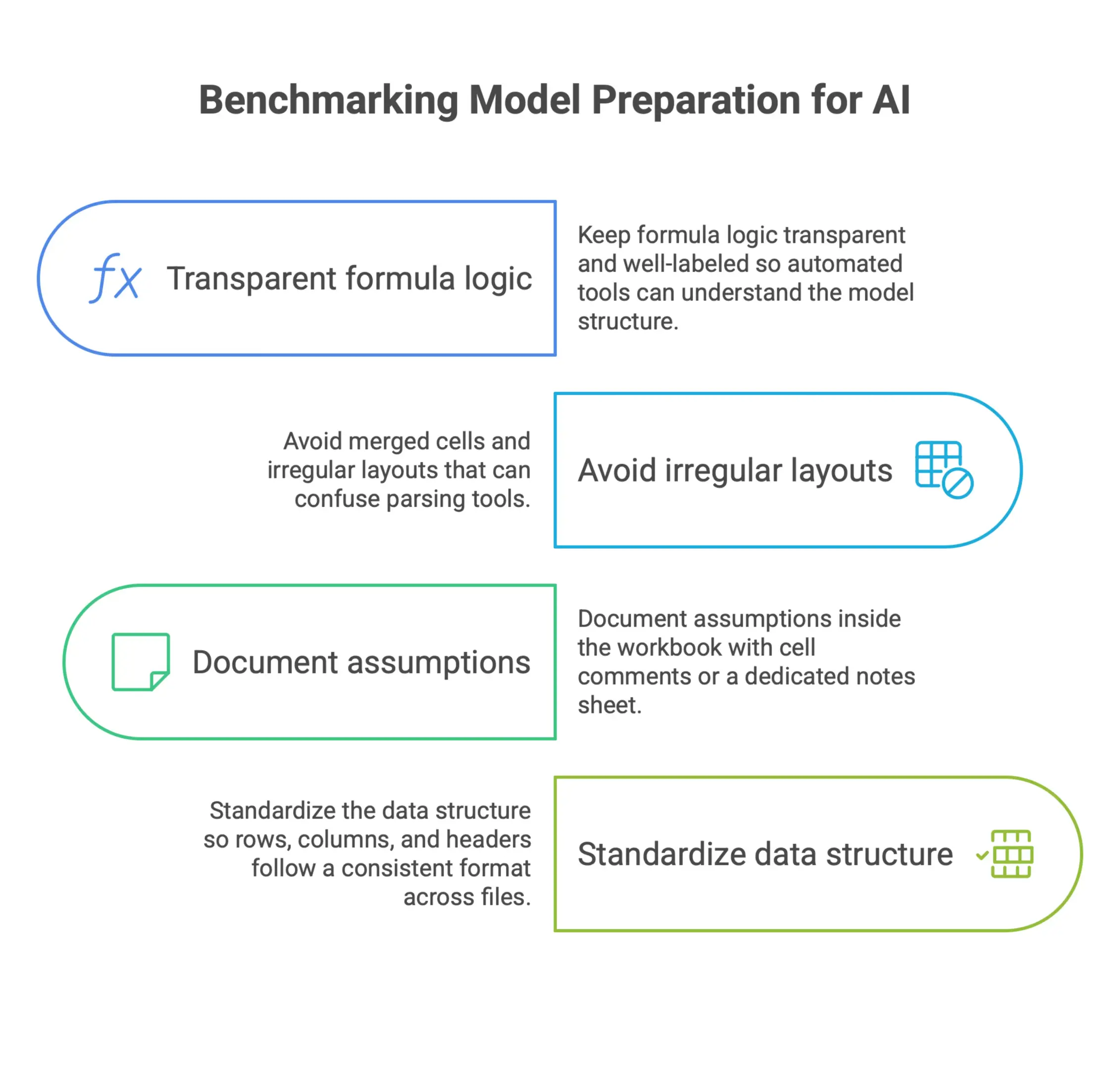
To get your benchmarking models ready for that kind of integration, focus on a few practical basics:
- Keep formula logic transparent and well-labeled so automated tools can understand the model structure
- Avoid merged cells and irregular layouts that can confuse parsing tools
- Document assumptions inside the workbook with cell comments or a dedicated notes sheet
- Standardize the data structure so rows, columns, and headers follow a consistent format across files used in automation
None of this requires a major rebuild. Most of it is just good spreadsheet discipline, the kind experienced analysts already know matters. The difference is that doing it consistently now makes your models easier to scale as automation improves. Whether you are evaluating project cost performance, supplier pricing, or operational efficiency, a clean, structured Excel model is what makes AI-assisted analysis practical. It also reduces the higher risk of errors when multiple users are editing related files. Hardware factors such as core count and hyper threading can also influence spreadsheet automation and benchmark performance.
Google Sheets vs Excel for Benchmarking: Key Differences, Collaboration, and Version Control
Excel is often the default choice for benchmarking, but it is not always the only option. Google Sheets is a familiar alternative for teams that need browser-based access, quicker collaboration, or simpler sharing. The key differences matter most when you are deciding how the team will manage data, reporting, and ongoing updates.
Compare Google Sheets and Excel for Benchmarking Workflows and Team Access
Google Sheets and Excel both support spreadsheet-based benchmarking, but they handle workflows differently. Excel is usually stronger for advanced features, larger models, and complex calculations. Google Sheets is often more convenient when the work needs to happen in the same file across distributed users.
For benchmarking tasks that rely on deeper formulas, pivot tables, or more robust reporting layers, Excel usually has the edge. For lighter collaboration and fast access, Google Sheets can be a familiar option. The choice depends on the team, the data, and the reporting requirements.
A simple way to think about it:
- Excel is better for deep analysis and heavier spreadsheet logic
- Google Sheets is better for fast sharing and browser access
- Both can work, but the key differences show up as models become more complex
Manage Multiple Users, the Same File, and Version Conflicts More Safely
Collaboration is often where spreadsheet benchmarking becomes time consuming. When multiple users need to edit the same file, even a strong model can become hard to maintain. That is true in Excel and can also be an issue in Google Sheets if the workbook is not structured carefully.
Version control matters because benchmarking files often have more than one owner. One team member may update financial data, another may refresh benchmark data, and a third may be responsible for reporting. Without clear ownership, edits can conflict and the workbook can quickly drift.
To reduce that risk:
- Assign one person or support team member to own the master file
- Separate input tabs from reporting tabs
- Use a clear naming system for archived versions
- Avoid relying solely on email attachments for workbook updates
This keeps the workbook easier to manage and reduces the chance that a critical formula gets overwritten during routine updates.
Decide When to Rely on Excel and When to Move to Other Software
The right tool depends on the business need. Excel is often enough for smaller benchmarking projects, especially when the team is comfortable with spreadsheets and the reporting cycle is predictable. But as the file gets larger, the workflows get more complex, and the number of users grows, other software may become a better fit.
The main questions to ask are:
- Does the team need real-time updates?
- Are multiple people working in the same file?
- Are the calculations becoming too complex to manage safely?
- Are the reporting requirements growing beyond what a spreadsheet can handle?
If the answer to several of those is yes, it may be time to move beyond Excel. That does not mean abandoning spreadsheet work entirely. It means using the right software for the job and keeping Excel where it still adds value. A good team knows when to manage in Excel and when to switch to tools built for scale.
Frequently Asked Questions
What does benchmarking in Excel mean?
Benchmarking in Excel means organizing performance data and comparing it against a reference point, such as an internal target, historical baseline, competitor metric, or industry standard. The goal is to identify gaps, trends, and opportunities for improvement.
What can Excel be used to benchmark?
Excel can be used for KPI tracking, salary and compensation benchmarking, competitive analysis, operational performance comparisons, vendor scoring, and multi-criteria evaluations. The common structure is measured values, reference values, and a clear comparison.
How should a benchmarking Excel template be structured?
A strong benchmarking workbook should separate raw data, benchmark peers, comparison tables, and reports into dedicated sheets. This makes the file easier to audit, update, and reuse across reporting cycles.
When is Excel not enough for benchmarking?
Excel may become limiting when data volumes grow, manual refreshes become hard to maintain, multiple users need live access, or the analysis requires real-time data connections and advanced reporting. In those cases, BI platforms or dedicated analytics tools may be a better fit.
How do you turn benchmarking results into action?
Start by identifying the largest performance gaps, then prioritize them by business impact. From there, assign each gap a specific action, owner, deadline, and expected outcome inside the same workbook so progress can be tracked over time.
Ready to Take the Next Step?
If you’re exploring modern cost estimation platforms, check out Nomitech’s full suite or get in touch with our team to find the right fit for your workflows.





Stay Up to Date
Subscribe to our Newsletter today and receive the latest updates, trends, expert insights, and exclusive offers tailored to your specific industry.